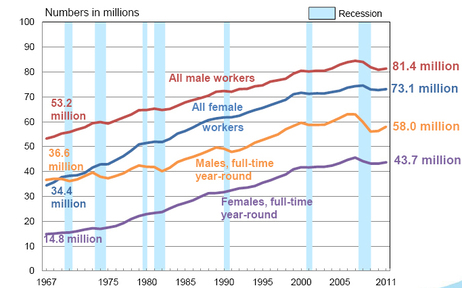
There's always plenty of talk about how many jobs have been saved or created but not nearly enough of what kind of jobs there are. That's because quantity is relatively much easier to articulate than quantity and by articulate I mean "use for political purposes." But today, NPR has this:
and this:
NPR says nothing about the gender pay gap, but isn't it amazing that since...oh, somewhere in the late 80s I guess (the graph inexplicably has no bottom axis but indicates it covers 1967-2011, but the tick marks don't seem to add up right), the two lines stop slowly coming together as they had been, and start moving up and down in sync, apparently perfectly preserving the inequality?
Also for the top chart, I note that of all male workers, 71% are currently in full time jobs now, versus 68% in 1967, while for female workers about 60% are currently full time, versus 43% in 1967.
NPR's point is that "while high unemployment remains a big problem for the U.S. labor market, it's not the only problem. There's also a long-term stagnation in real earnings for people who have jobs."
Moreover one full time job with middle class wages, sick pay, vacation pay, health care benefits, and a pension plan is not equal to one part time job at minimum wage with no benefits of any kind. And the trend is indeed McJobs-ward. Yet the raw number is the primary message of the monthly obsession over job creation/savings.


No comments:
Post a Comment